SHOP OUR TOP RANGES
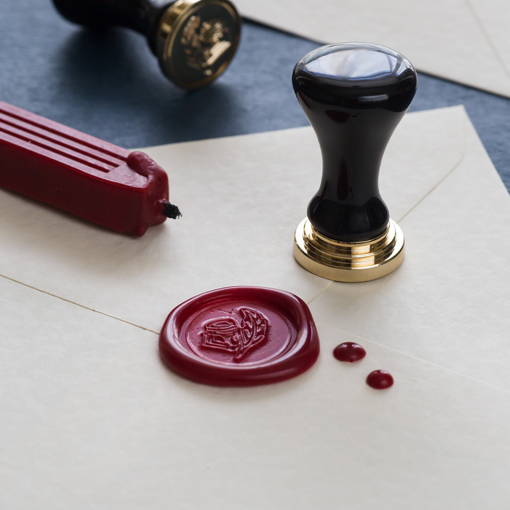
WAX & SEALING
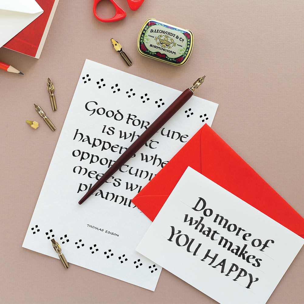
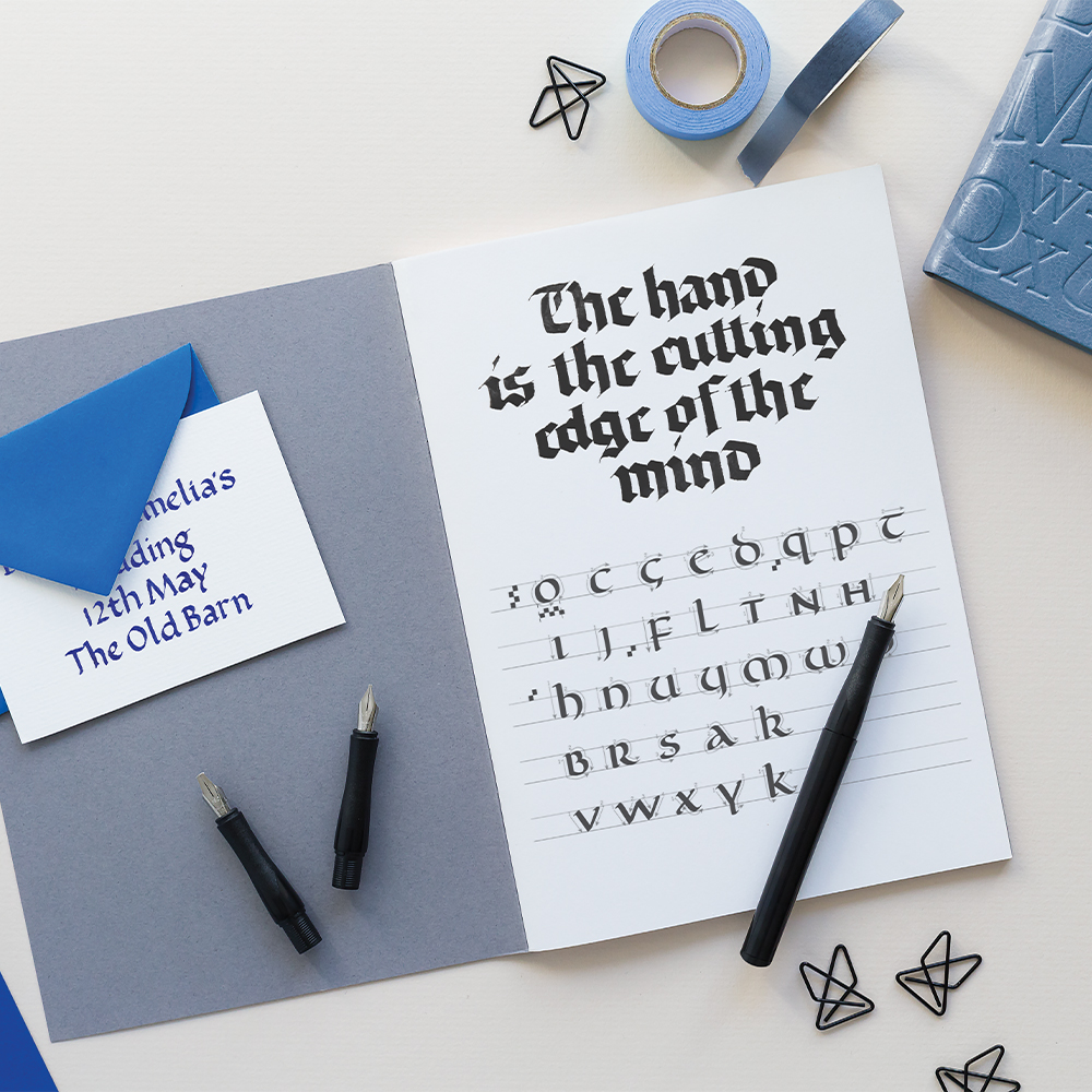
DIP PENS
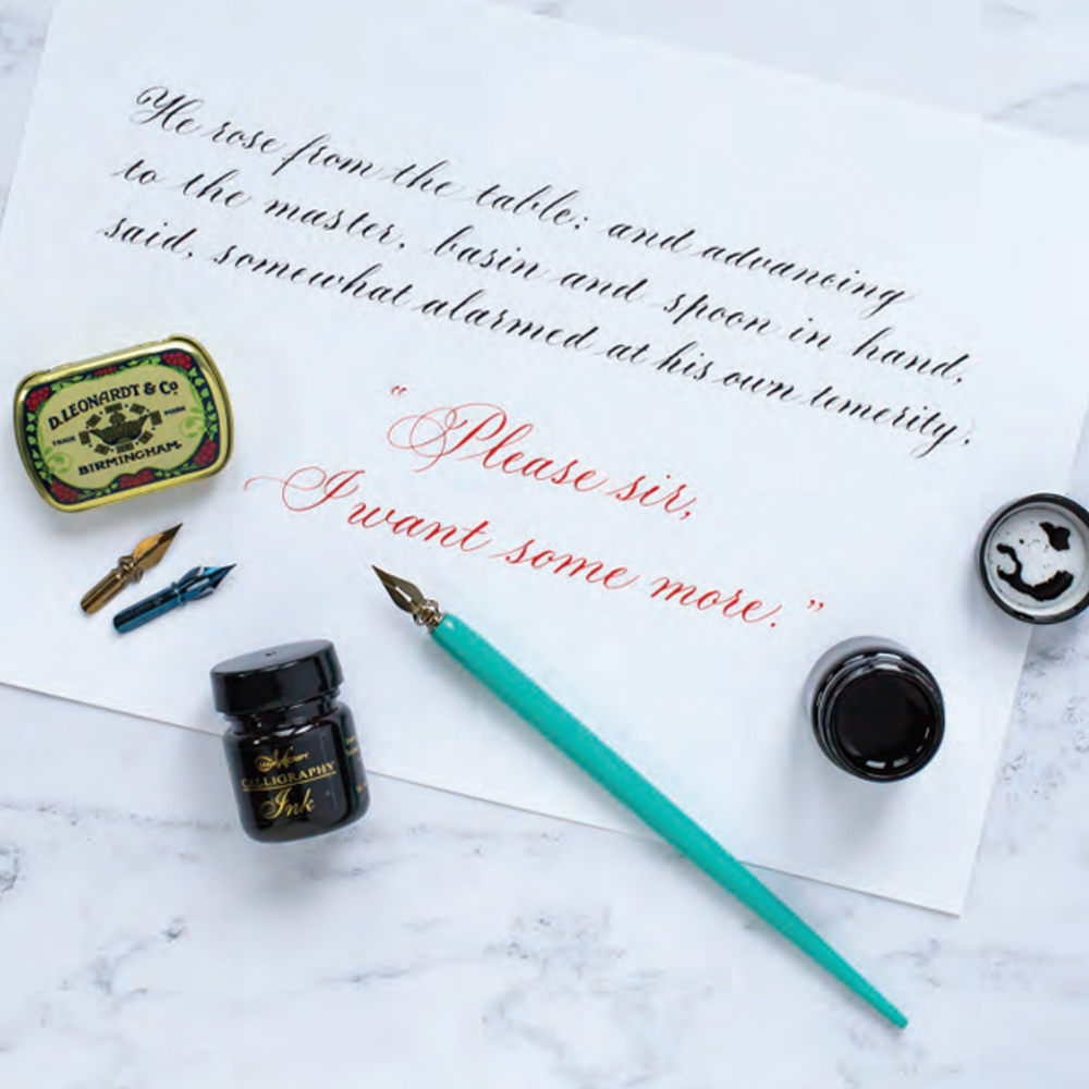
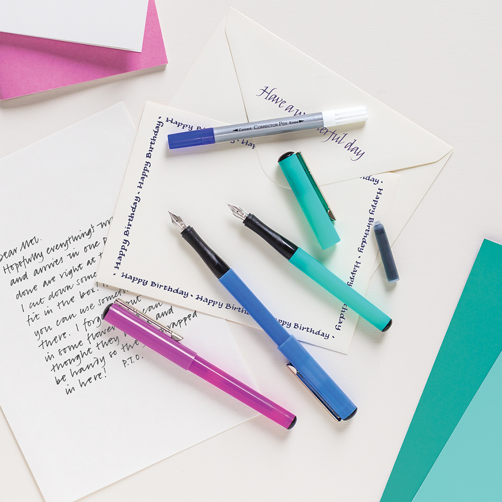
FOUNTAIN PEN CALLIGRAPHY
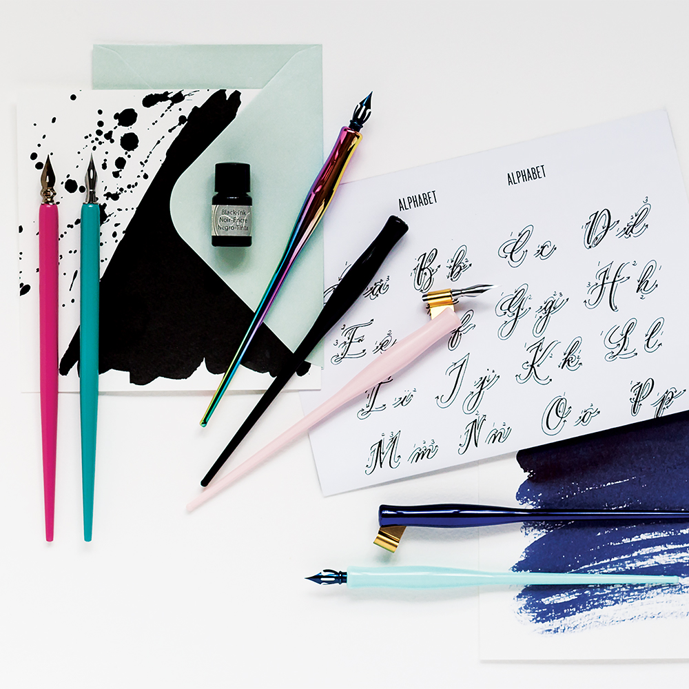
MODERN CALLIGRAPHY
CALLIGRAPHY KITS & GIFT SETS
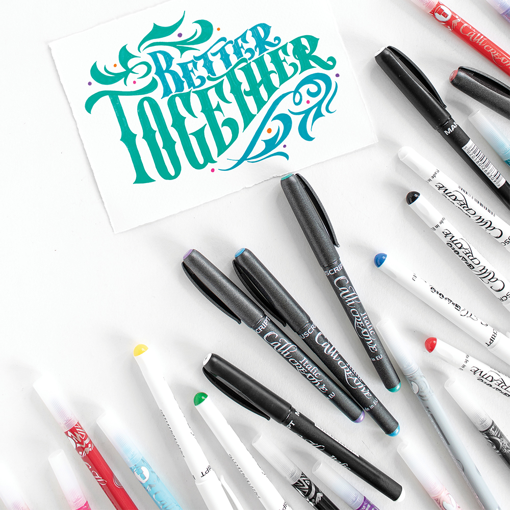
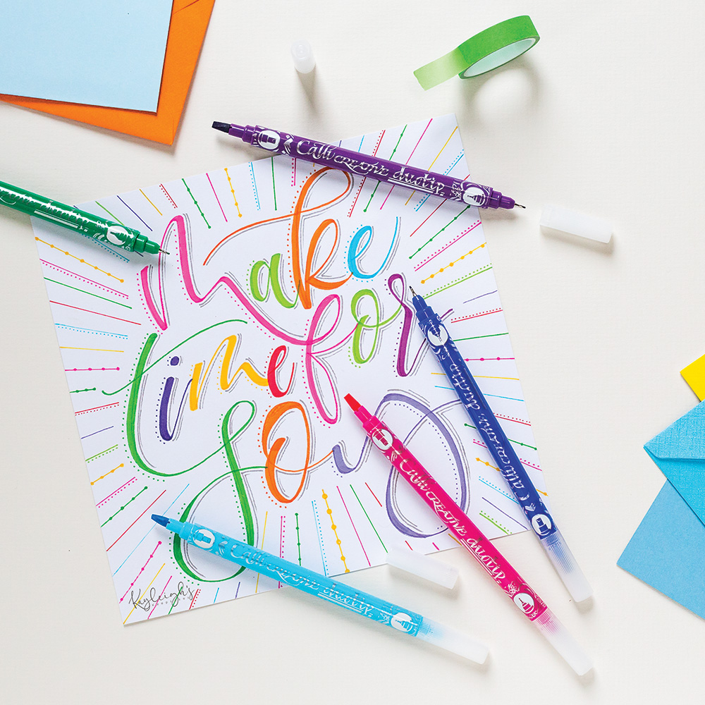
CALLICREATIVE MARKERS
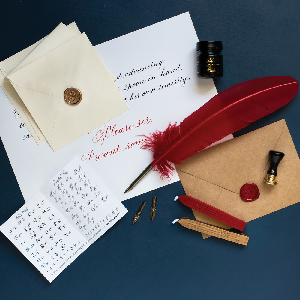
HERITAGE COLLECTION
STATIONERY & EDUCATION


Our Top Picks
Industry experts since 1856
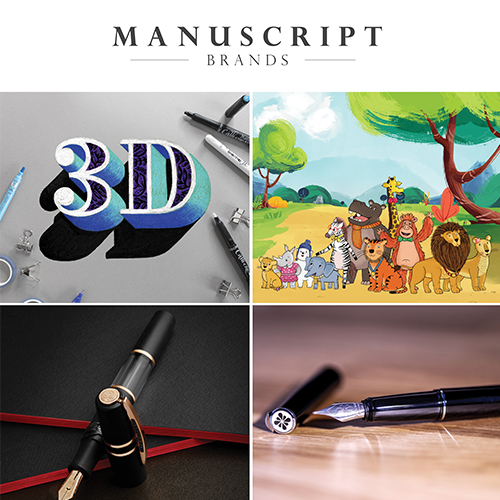
WELCOME TO MANUSCRIPT
At Manuscript Pen Company we pride ourselves as being known as ‘The Calligraphy Company’ but that is only part of the story. Whether its calligraphy dip pens and nibs, fountain pens, markers or craft kits, we have writing tools and bundles suitable for every creative project. We invite you to explore our website and learn more about us, our products and passion for writing, drawing, colouring & crafting.